SETE25
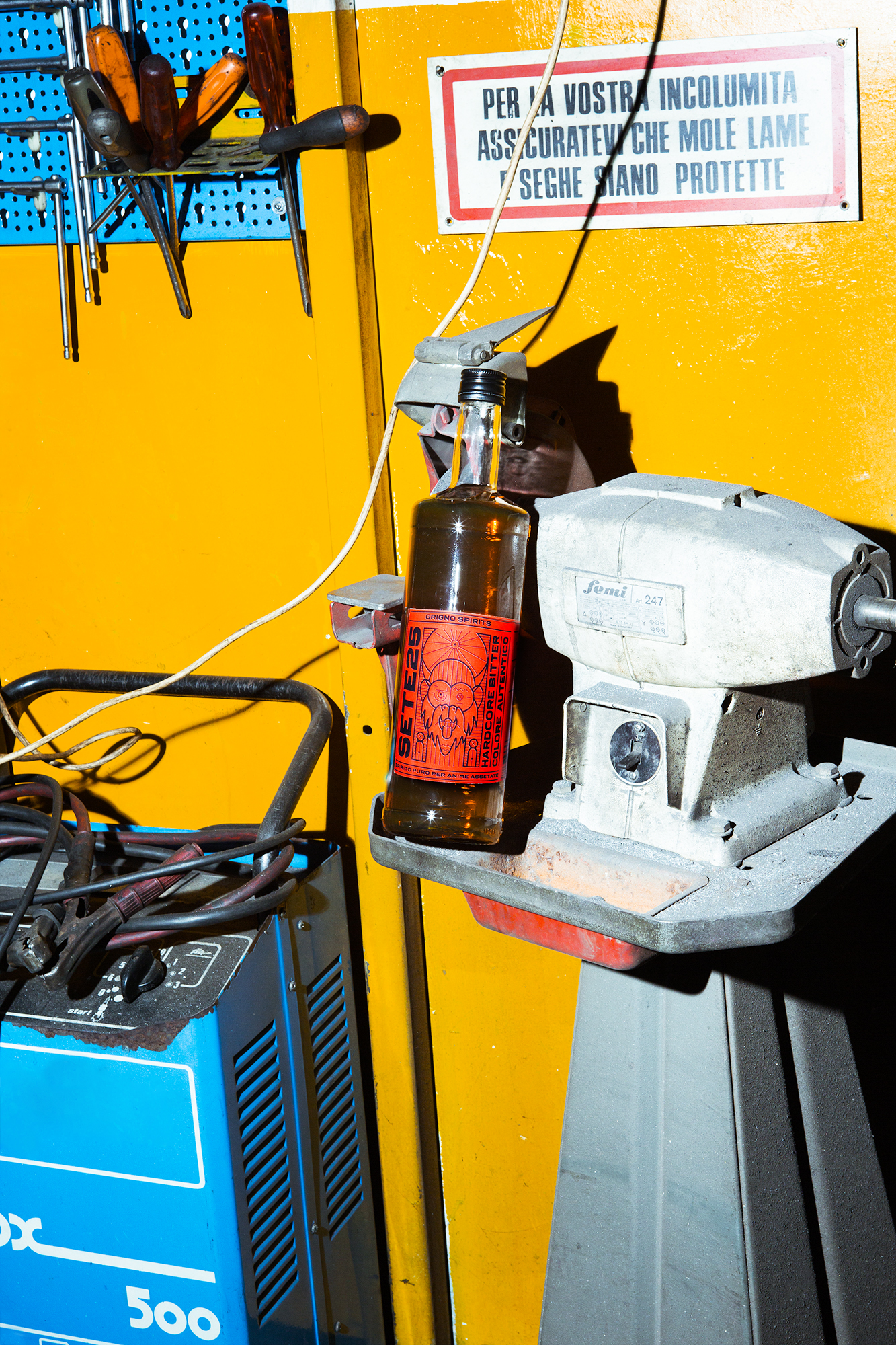
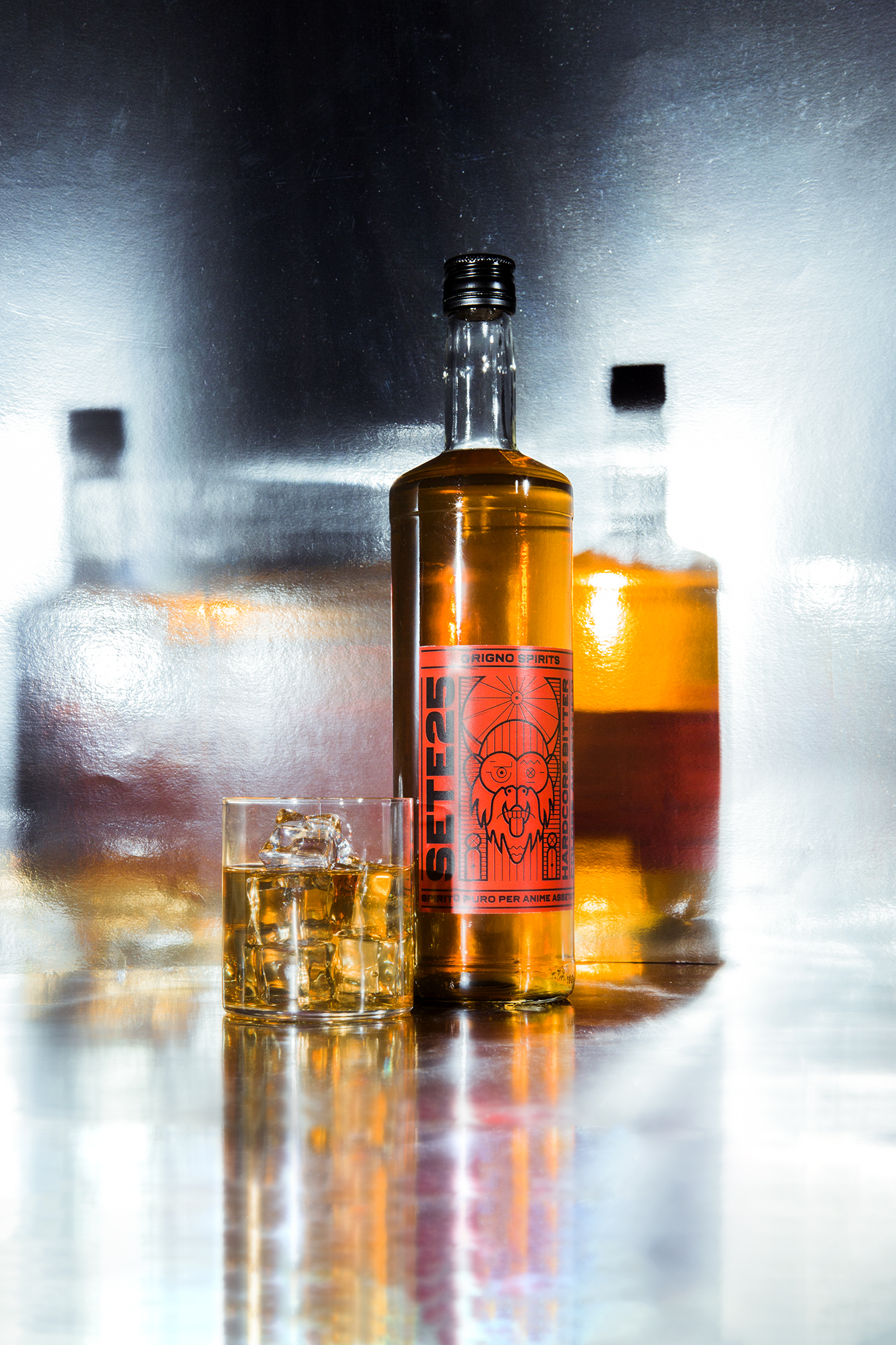
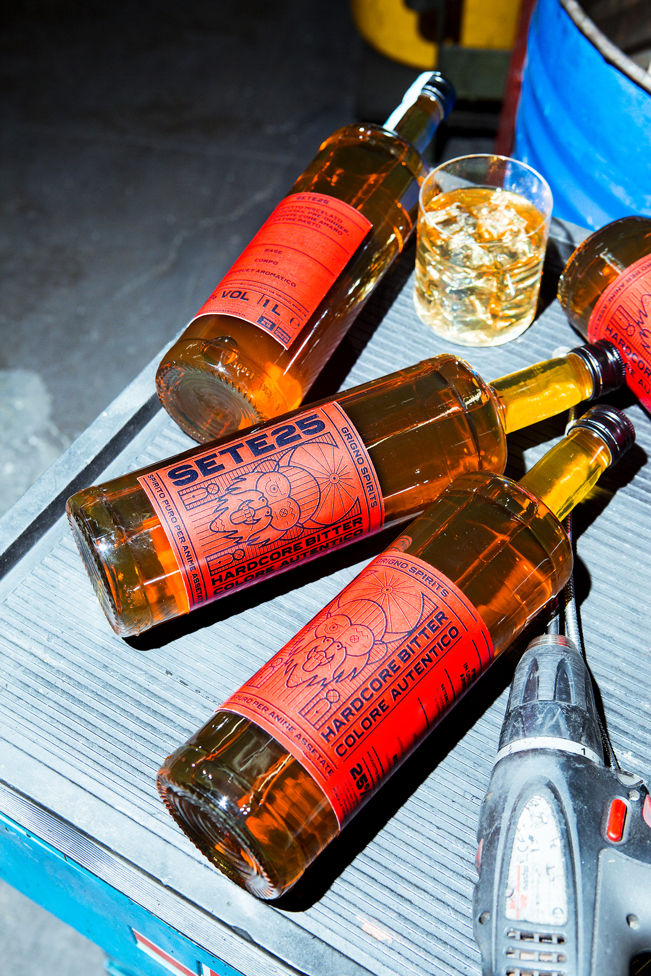
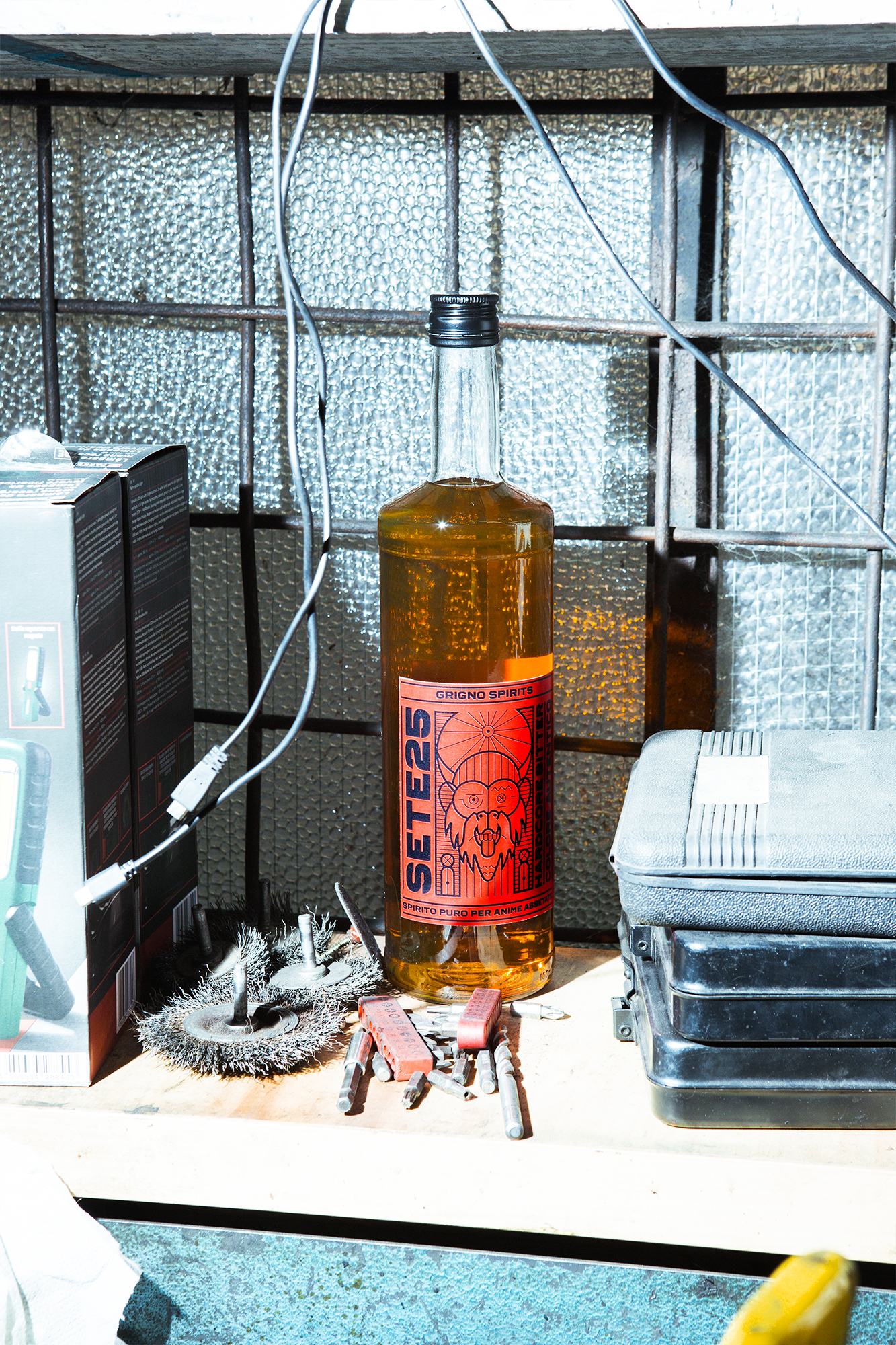
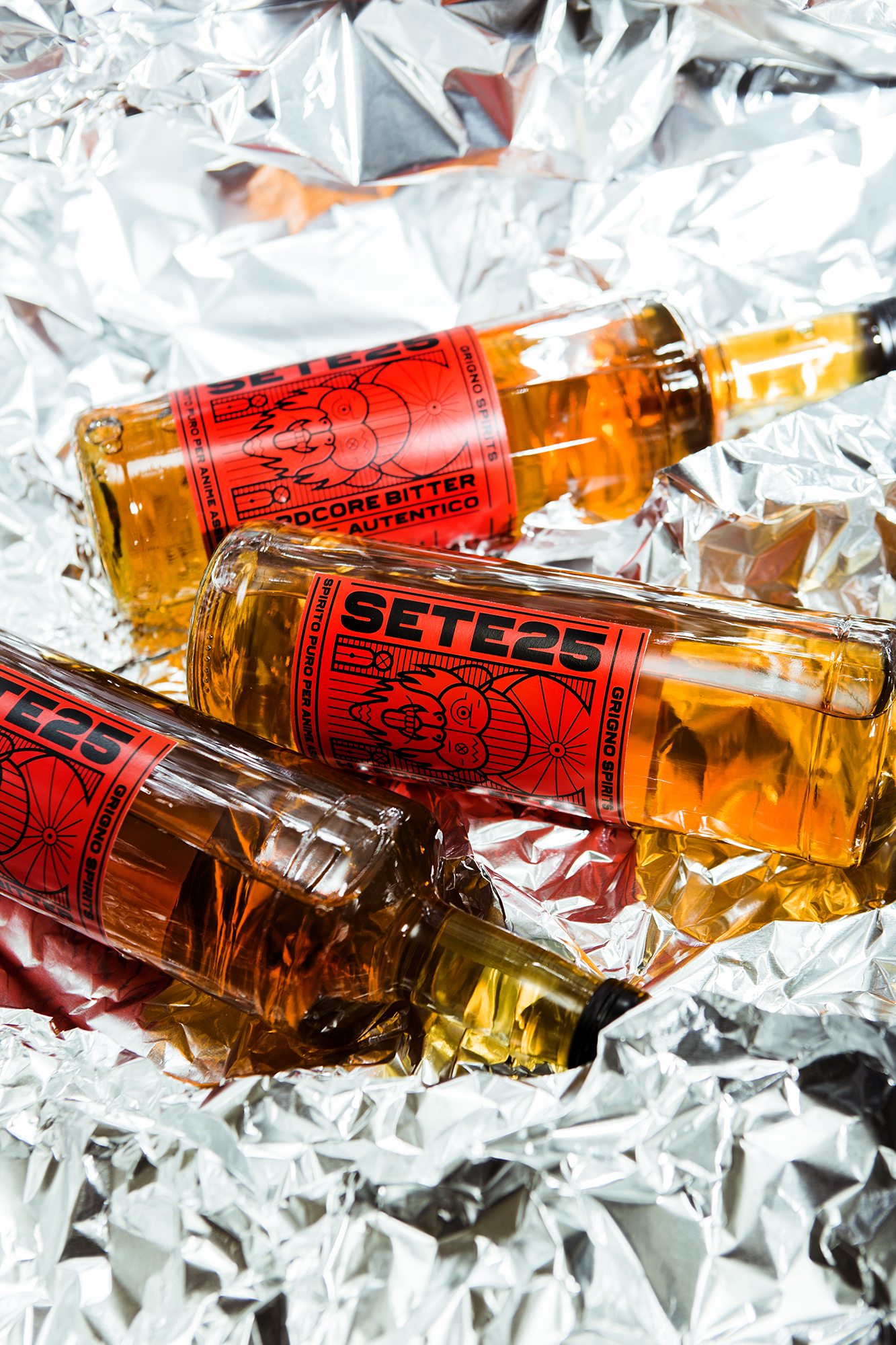
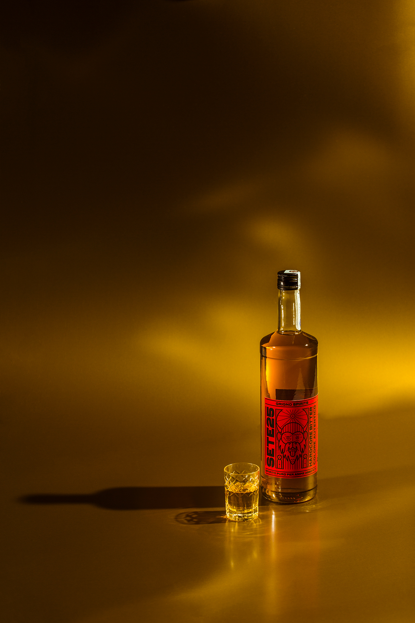
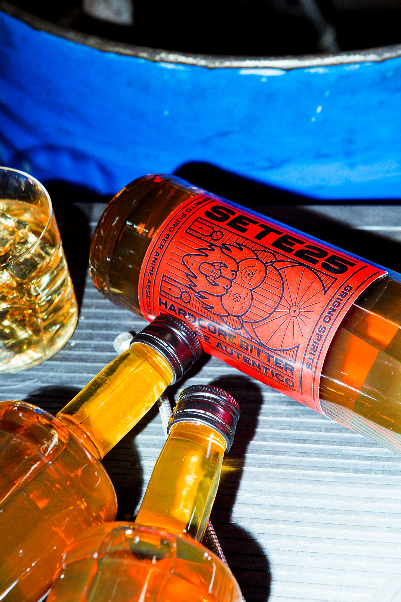
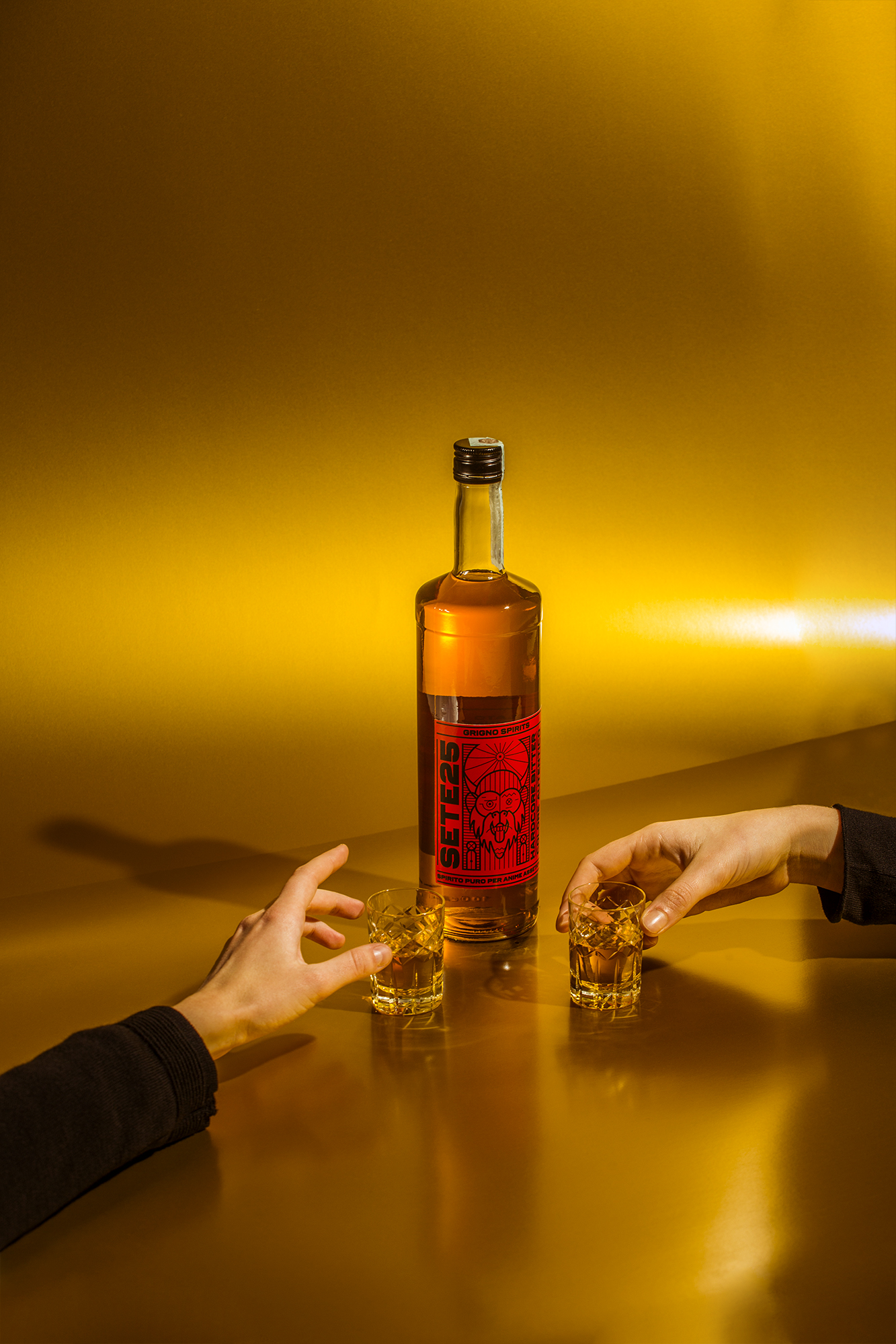
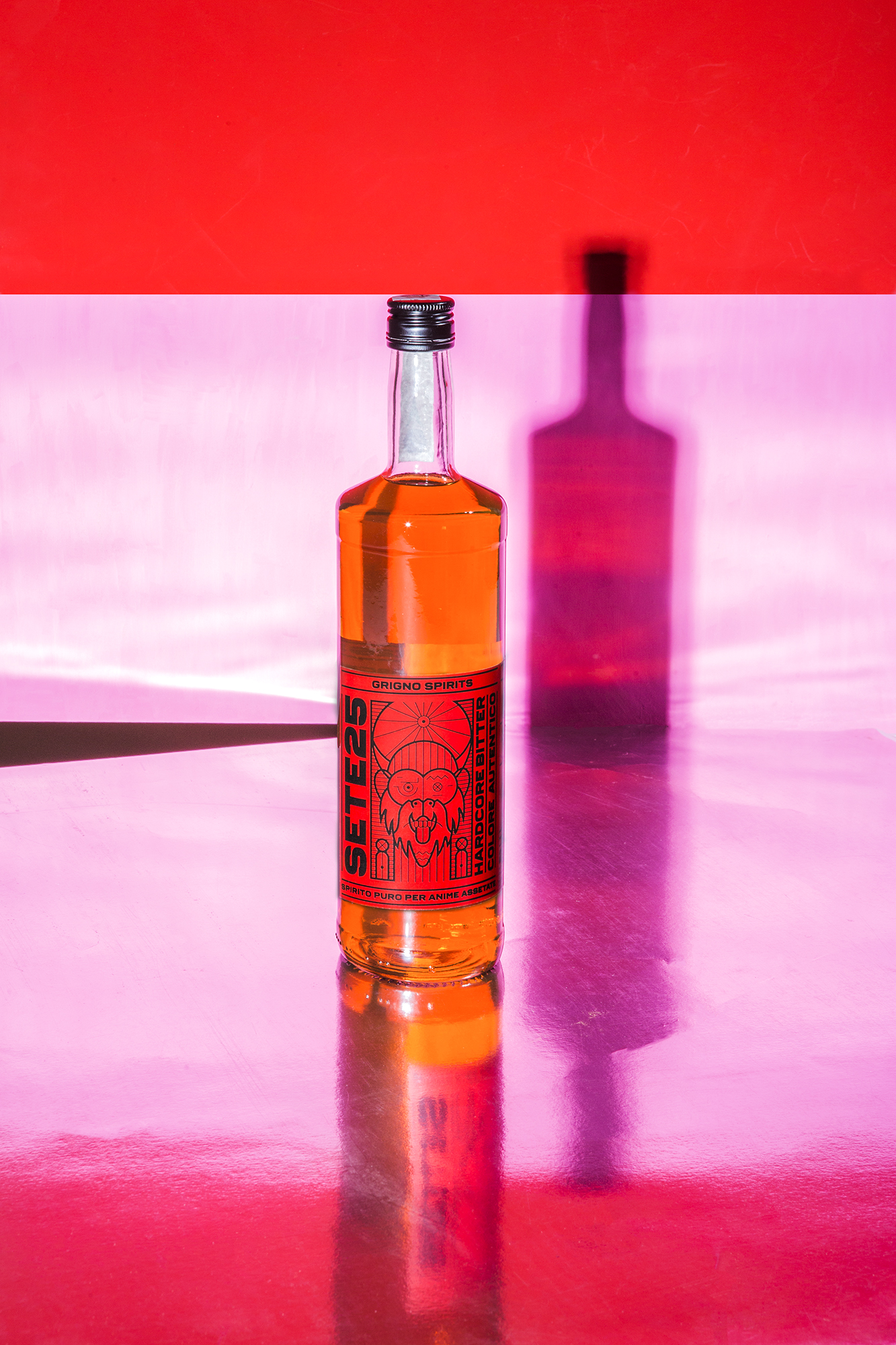
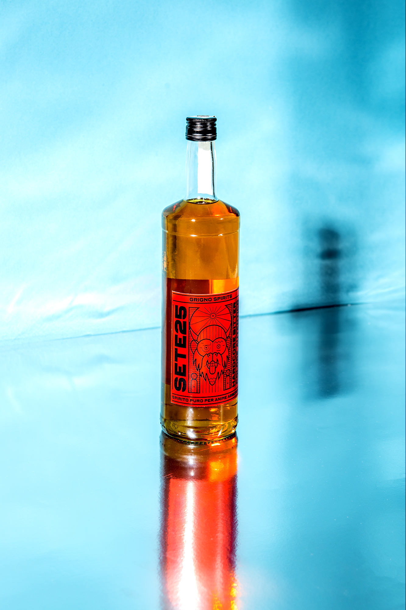
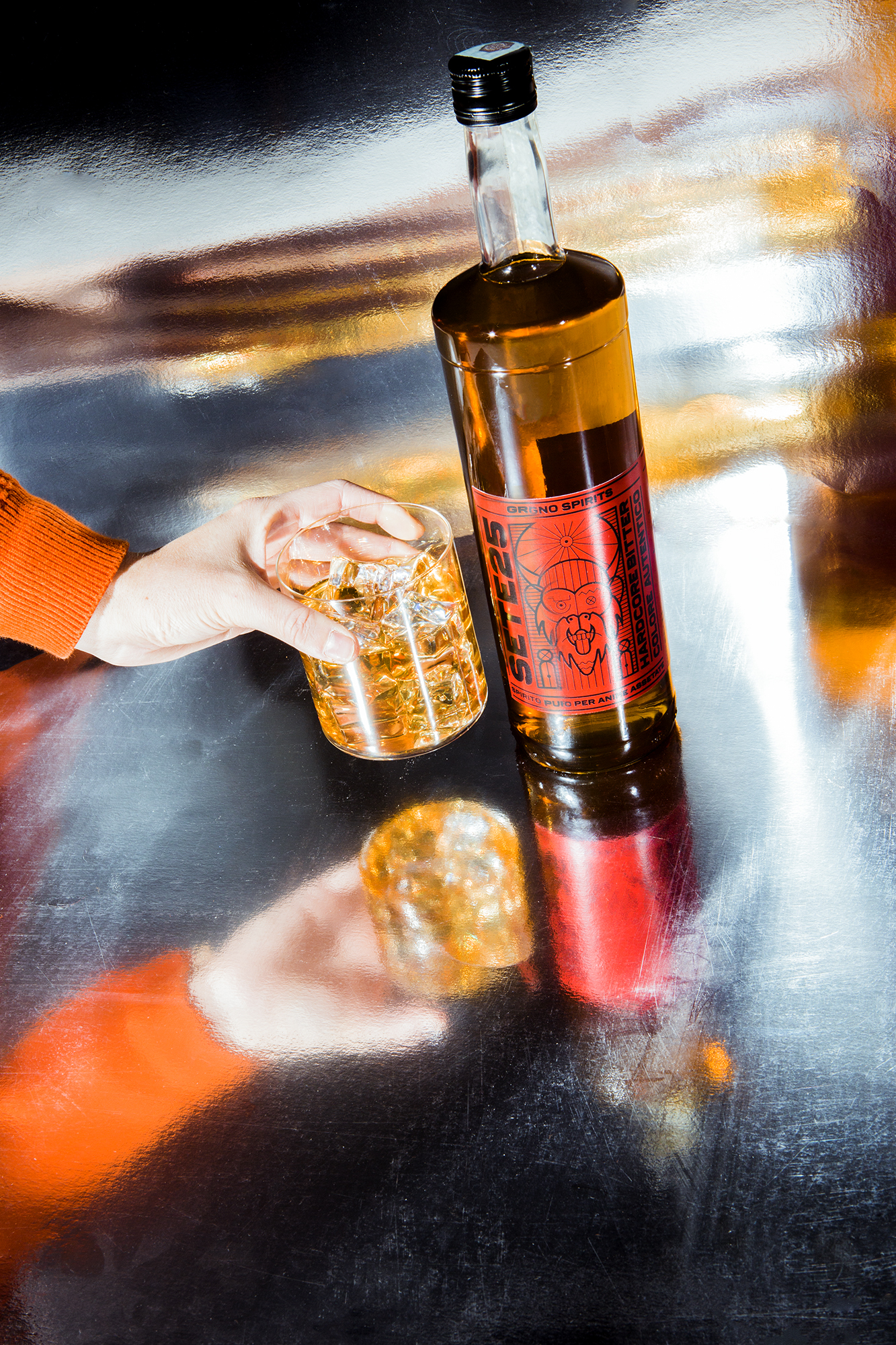
The red label overlayed with intricate line work creates a packaging system that feels uncompromising. The dual-toned, black and red color palette is strong and perfectly fits the brand’s “hardcore” approach.
Demons. Geometry. Japanese theatrics. They are the ingredients of SETE25, the hardcore bitter by Grigno Spirits. From the positioning Pure Spirit for thirsty souls comes the graphic design of the bottle, which has as its protagonist a demon of Japanese mythology related to the consumption of alcoholic beverages. The absence of artificial dyes makes SETE25 a bitter that stands out from competitors in the industry even in the color: the classic red is there, but only on the label. And it gives life to a color contrast that tells the unique character of the brand.
Published on DIELINE
Art direction: Alessandro Saglietti
